Welcoming Signage Beyond Welcome Signs
Signage is everywhere, indoors and out — on roads, buildings, doors, windows, even in our homes. Signs alert us to information, rules, safety, and more. Consuming over 10,000 messages a day, our first instinct might be, “NO MORE!” But, let’s distinguish signage from marketing ads and appreciate the important (and welcome) role of signage, beyond welcome signs.
Warm Welcomes beyond Welcome Signs
Use signage to create feelings
Apart from marketing and selling, signage serves a myriad of functions. Of course, signs tell people where to go, what to do, and what to expect. In training and learning environments, signs welcome, direct, divide, and orient visitors. But, beyond those particular messages, signage shapes how people feel. Think about the signs that litter the buildings, stores, and dwellings you enter each day. Some quickly put you at ease; others put you on edge. It all depends on the messaging and presentation. Welcome signs can feel less than welcoming, just as warning signs can be made to feel less ominous. These are some favorites:
- For wearing masks: We love your smile, but please keep it covered. Or: If you come in without a mask, we’ll have to take your temperature (sorry, we only have rectal thermometers).
- For bathrooms: We AIM to please. You AIM, too, please.
- For parks and yards: I don’t use your yard as a restroom, please don’t let your pet use mine.
Craft welcoming messages
To create signage that truly feels welcoming, embrace these six guidelines:
- Show visitors you’re expecting them – If you expect just a few people, consider personalized messages. Even if you have lots of students or visitors, consider each person’s individual experience. Develop signage that promotes a sense of belonging.
- Reduce confusion & uncertainty – put people at ease. Those entering unfamiliar territory appreciate clear, direct, easily visible signage. If you don’t already use them, consider signage that communicates expected wait times, locations, directions, and protocols. Create signs that instill a sense of calm. Be specific, as well. If you ran “out to lunch,” be specific about the time you’ll be back.
- Remember your manners and use humor – say “Please,” “Sorry,” and “Thank you.” Even for warnings, or signs that may cause inconvenience, these words of kindness and humor can soften the message. “SHHHH!!!,” for instance can feel quite different from “Please, LOL elsewhere.”
- Alleviate stress – the saying goes, “when in Rome, do as the Romans,” but you can’t do as the Romans if don’t know what they do. Not knowing norms and expectations can be stressful. Using signage to explain how things work is welcoming. You might also want to explain why–for safety, custom, convenience, expedience, etc.
- Strive for simplicity and clarity – avoid signs that might be ambigous or diffcult to understand. Simple language, images, and organization help make signage an “easy read.” The easier signs are to read, the more welcoming they feel.
- Create visual appeal – while gaudy looking signs might be effective at catching attention, they might not be the best way to create an inviting environment. Depending the message, consider signs that visually draw you in.
These six rules of thumb can put people at ease and make feel truly welcome.
Design Clear Signage
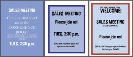
 With these guidelines in place, designers also recommend the following tips when it comes to designing signage. No explanation because these before and after examples speak for themselves! Use
- “White” space – avoid clutter and remember “less is more”
- Easy-to-read fonts – select fonts that are easy on the eye; consider ease of reading upper and lower case letters. Also, limit the number of fonts used in a single sign
 Contrasting colors – choose colors that stand out and complement one another
- Concise messaging – keep it simple and focus on the most important messages
- Use symbols – if symbols are well known, use them!
- Add a border to draw the eye to your message
Make sure signage can’t be missed!
Determine WHERE to place signs
 Once you’ve developed your message and designed an easy-t0-read sign, you’re not quite done. If nobody sees your sign, it doesn’t matter how good it is! To be sure you place your sign in a location that can’t be missed:
- Choose a high visibility location – know how traffic flows and think about where you would look for information
- Don’t compete with other messaging – if your sign is burried amidst lots of other information, it could be missed
- Set the sign at an appropropriate height – if your sign will be in a crowded place, it might need to be higher than you think. If placed too high, however, if might not be in the line of sight of your intended audience.
- Set up multiple signs – one sign may not be enough. Like trail blazes on a hike, follow-up signs should be visible before the prior sign is out of sight. For directions, be sure to set up a sign at every turn. When it comes to instructions, a first sign might be posted to set expectations or give advanced warning. A second sign should then be place when and where the action will be taken.
Decide HOW to post signs
Signage and sign stands do not need to be expensive. Using Trainers Warehouse Floor Stands, Table Stands and DocU-Sleeves, place signs wherever you need them.
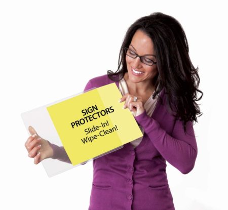
The easiest way to create a sign in a flash, it to draw it on a write-on, wipe-off surface. Use white or lightly-colored paper inside a DocU-Sleeve and write your message with a dry-erase marker. To make a change, quickly wipe it clean and re-write the sign.
Second easiest is to create a document on the computer and print it out on standard sized paper. Slide the sheet into a DocU-Sleeve or other sheet protector and post on a wall or in a sign stand.
Finally, you can work with a sign printing company to design and/or print your signs. While this solution is more costly, getting help with the design might end up saving you time. Sign printers will also have the equipment to print in large formats and on a range of materials included cardboard and fabric.
Signing off on Welcome Signs
Despite the abundance of marketing messages that bombard us every day, signage plays an important role in setting a tone, sculpting the way people feel about their environment, and communicating critical information. Experienced and novice sign makers are wise to consider the feelings they hope to project with the message they’re sending. They must design signs with smart messaging and graphics, then post them where they can’t be missed, with Trainers Warehouse Floor and Table Stands, plus ever versatile DocU-Sleeves.

